
Twitter logo design is one of the hot talking points whenever someone indulges in the back story of logos. Twitter is one of the most crowded social media platforms everyone can easily identify the twitter logo design even after closing their eyes.
Yes, it is the eye-catching “blue Bird”. Wait, Twitter is not a bird but the bird is Twitter. The iconic bird is, without a doubt, one of the most recognizable company logos in the world. This essay will go into the specifics of Twitter’s brand identity journey.
Pre-launch Twitter Logo Design
The pre-launch design was the least attractive in Twitter logo design history. The Twitter logo design had a slimy green colour theme which looked unappealing in contrast to today’s Twitter logo. In fact, Twitter wasn’t even called Twitter before the launch, it was called twttr as the pre-launch logo suggests. Luckily this design never made it to the status of twitter’s official emblem. The design looked like this, would you have imagined twitter using this logo design?
![]()
The Twitter Logo Design at the Launch
As mentioned previously the pre-launch logo never came to light, it was changed right before the launch. A graphic designer who goes by the name “Linda Gavin” saved the day. For its official launch in July 2006, she had just one day to design the twitter logo design for the launch. Linda’s final design appealed to Galvin, the co-founder of Twitter, so much that he instantly decided to use it for the launch. The design would go on to be the official Twitter logo design until 2010. Not bad for a day’s work, right?

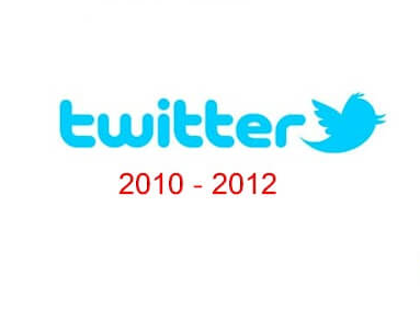
The Introduction of the Infamous Blue Bird
Four years later, in 2010 twitter decided that its logo needs a change, a change that would reflect its nature. This is when the infamous blue bird was introduced in its logo design. The bird perfectly reflected the short quick messages, a tweet, the social media giant revolves around.
The blue bird was to become symbolic with the name Twitter in the years to come. Here are some interesting facts about the symbolic Twitter blue bird:
- The bird became the company’s mascot only in 2010.
- Twitter bought the bird design on iStock for just $15.
- The bird was initially named “Larry” after the basketball player Larry Bird.
- As of today, the bird goes by the name“Twitter”.
Why The Bird?
Now, one could ask why the bird? Why not any other animal or object was opted to be used in the logo design when the twitter decided its time for a change in the logo. What inspired the famous blue bird for the Twitter logo design? Following could be some possible answers to this foundational question about twitter’s brand identity:
- “Twitter” sounds a lot like “tweet”, which is a sound made by birds
- A bird symbolizes freedom and endless possibilities.
- Quick short messages are synonymous with small, fast-flying birds.
These are the operational foundations of the social media giant and are probably the reason for the inspiration behind the blue bird.
Read more: The Bird has flown away from Musk’s Twitter with the arrival of ‘X’
The Modern Bird
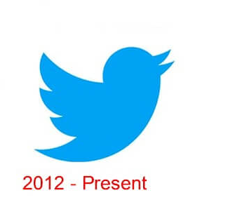
As the brand’s popularity grew rapidly, the management felt the need to refresh the brand image. In 2012 Twitter decided to get rid of the text in their logo design and decided to keep the bird only. By then the blue bird had become so popular and symbolic with the name Twitter that there was no need to keep the text in twitter’s logo design.
However, the blue bird now had a new image. The original bird was very different from its current version, It was a slender creature with a stylized eye and two paws. The original was faced to the left, and as you now know It was named Larry after Larry Bird of the NBA’s Boston Celtics.
The current version has much more prominence to it as the logo now features only the bird and nothing else. The beak pointed higher now, toward the sky, while the fluff on top has disappeared. In addition to this, the head has grown smaller, while the number of feathers on the wing has been reduced. The name of the bird is now Twitter the bird, whereas it was Larry the Bird previously. This design has been featured in twitter’s logo since 2012 till date.
The Importance of Twitter’s Logo in its Overall Brand Image
It would be impossible for one to deny the significance of the role the bird has played in developing the Twitter brand over the years. The platform’s simplicity is the key reason that has led people to flock to the social media giant. This simplicity echoes in their logo design, and it is in complete harmony with the company’s core objectives.
Twitter has become very protective of its logo, with explicit rules against modifying the logo in any way. This strict policy has also helped the company maintain a consistent brand image across all platforms.
Final Thoughts
You must know the importance of a brand logo by now and what it could do for your brand identity if made appealing enough and in perfect harmony with your company’s core objectives. Over time it will become synonymous with your business, so you need to take all the precautionary measures against what you attach your business identity with.
Hence, if you need a logo design for your business, you should hire experts who will understand the core objectives of your business first and keep them in mind while designing your business logo.
iCreative has experts who will go to great extents to understand the core objectives of your business and what you have in mind in regard to your logo. They will also suggest what will work best for you. iCreative has helped its clients revamp their brand image with fresh, attractive, and lively logos, which in turn has improved their traffic and sales. To book a free consultation session with one of our experts, click here.