
You have to analyze how the world has changed in the past century. Forget the hundred years. Things are not what they seem, even in the last decade. Understanding this change over time and making sure that your company grows with the rest of the world is no easy task. Any company that has been working all these years and still has not lost its standing is a commendable task indeed. Some of the very few companies that started back in the 80s are still there in the market, and not only that; they are also dominating the whole market even today. In the sea of various competitors, Coca-Cola is one of those brands which have stayed its ground. One of the main reasons why is the Coca Cola logo design, which has remained interactive and attractive all these years.
The Coca-Cola concoction was first launched in -1886 by Dr. John Pemberton- a pharmacist who concocted a sweet-smelling caramel liquid, and when it did to Jacob’s pharmacy.
The mixture was combined with carbonated water and was then given to customers to try. they were given the incentive that the drink was something special.
After they liked what they were drinking, Pemberton started to put it on sale for five cents a glass.
The Coca Cola Logo Design History
Pemberton was not a pharmacist but had also been enlisted as a confederate soldier. However, he was wounded during a war which eventually led him to become addicted to morphine. Therefore he tried to find a cure for his addiction.
He then started to experiment with coca and coca wines. Using these ingredients, he came up with Pemberton’s French wine cocoa and advertised it as a tonic cure-all. However, this tonic had alcohol in it, which was later banned in Atlanta in 1886.
However, this did not let him down, and he modified his formula and invented another drink. this time without the alcohol but rather with carbonated water, which was considered very good for one’s health.
This drink was also marketed the same way as the last one. It was being advertised as a cure for all, i.e., headaches, impotence, dyspepsia, and morphine addiction as well. Moreover, it was also considered a health booster and general stimulant.
Although it came from nothing, from being prescribed as medicine, it is now one of the most well-known brand names for beverages worldwide. Today you can identify its unique taste, and it has little to no competition in the soft drinks department. It sells more than 1.7 billion servings, which people enjoy globally.
One of the main reasons the product is still recognized today is also because of its custom design logo. At first, Pemberton used a basic serif font as Coca-Cola. They were advertising in local newspapers as the new and popular beverage in town.
Coca Cola Logo Design in 1886
It all started in 1886 when John Stith Pemberton completed the recipe for his new drink. He also had a partner named Robinson who suggested the name coca-cola and had an idea to change the c’s to a different font to make the overall look good in advertising. He tried to write the letters in Spencerian script, which was quite a popular writing style.
Coca Cola Logo Design in 1887
As they moved on two years later, finally, on January 31, 1893, the Coca Cola logo design was trademarked, and it was showcased in the c’s tail in the first word.
The Spencerian script was designed back in the middle of the 18th century, somewhere in May 1886, and then was officially trademarked in 1887. This particular font was dominant for quite some time in the United States.
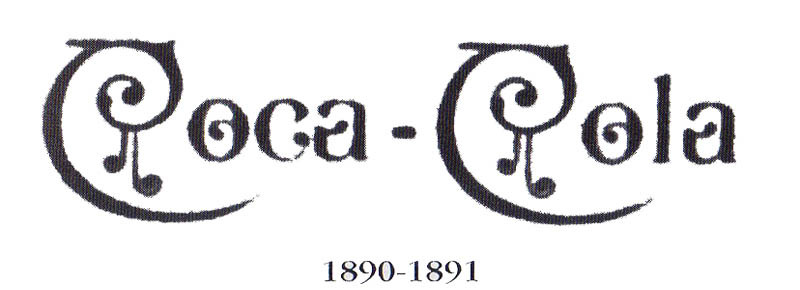
Logo Design Coca Cola in 1890-1891
This year they made a bold, loopy transformation. However, it was only there for one year.
There was a Coca-Cola Newspaper Advertisement, and the advertisement was featured in The Salem Evening News, Massachusetts, on June 23, 1893. The front page portrayed an excellent ad for Coca Cola, using the Coke trademark lettering, and showcasing the phrase “The Brain and Nerve Drink-Cures Headache.” This would be one of the earliest newspaper ads for Coca-Cola in a northern newspaper. The ad measured almost two by 2 inches.
Coca Cola Logo in 1941-1947
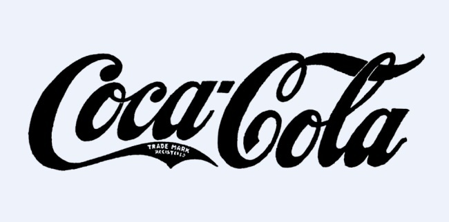
Then there came a time when the trademark registered phrase was removed from the word Coca. However, they changed it, redesigned it, and put it under the Coca Cola logo design instead. In 1947, the current Spencerian script we know today was trademarked.
Coca Cola Logo in 1947-1960
Coca Cola logo design has utilized the red disk/ button to advertise their company since 1947. the distinctive circular image. It was used to make sure that it got noticed by the onlookers. Moreover, in the following year, they were hung outside business places not only to advertise brands but also as decoration.
Logo Design in 1958-1960
Toward the 60s, the company decided to change the shape of the script, which resembled an arc. In 1958, another font named Arciforme sign, also known as the fishtail design, was introduced. This particular Coca Cola logo design was used in various places like cartoons, vending machines, and signage.
 Coca Cola Logo in 1969
In 1969, Coca-Cola showcased the Arden Square emblem. The coca-cola script was underlined with a white wave. This Coca Cola logo design is still used today.
Logo in 1982
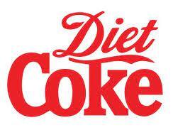
In 1980 they started to put slogans with the Coca Cola logo design like “coke it is.” Moreover, in 1982, the diet coke was introduced and the first extension of the Coca-Cola trademark. In addition to that, the infamous Coca Cola logo design script was changed to a slab serif font. The first diet coke design included bold red letters over a white background.
The scripted version of this Coca Cola logo design was the first one that was used in advertisements in newspapers from 1986 to 1987. This early mark lacks a registration symbol. During this time, the Coca-Cola company was not registered at the patent office, and the trademark was officially granted a few years later. By this time, various versions of the brand mark had a rough and inconsistent look due to the lack of the modern tools we use today.
Logo in 2003
The launch of the Coke as the keeping it real campaign was for marketing purposes. With the white wave, they also include a yellow strike with some bubbles to showcase the effect of a bubbly drink. This Coca Cola logo design was kept the same for 3 years.
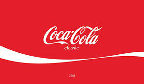
Logo Design in 2007
The redesigning brought back the classic Coca Cola logo design. The primary purpose was to represent the simple and bold design with a single white loop flowing under it.
Logo Design in 2011
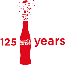
This was the year when all Coca-Cola celebrated its 125th anniversary in the market, and the Coca Cola logo design was completely changed for this year. It was a blend of all the previous years. It was a celebration which included the red color, the bottle design. The bubbles of a fizzy drink were coming out of the bottle, and in addition, they added the 125 years text in front of it.
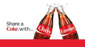
Logo Design in 2013-2014
The main thing about the new change was being relatable to the customers. They shared a coke campaign. The Coca-Cola campaign was replaced with your first name. This created a good hype among their clients. Every time they went to the shop, they would try to find their names on the bottle, just like name keychains, where the pleasure of seeing your name among the sea of other names was a mean feat. The names were also in the Spencerian font. However, there were some trademark issues when the new typeface with the work coke was introduced.
Design in 2016
This was the year they decided to bring a new campaign slogan to light, “taste the feeling.” not only that, but they also brought coca cola old and new strategies together, taking the best of both worlds.
Several versions of the Coca Cola logo design were used in the brand’s very early days due to the fact that a lot of the advertising materials were hand-painted with a red and white color scheme. Although the outlook was kept simple, it was distinctive enough to attract the younger population. At the beginning of the 20th century, a more consistent image was developed, which resulted in the 1940s logotype. However, many variations have been invented over the years to support graphics, such as shields, waves, and taglines, with the end of keeping the brand relevant.
Ending Note
The Coca-Cola brand has always been more than just a drink; it is a name that everyone recognizes regardless of their generation. It has come a long way since the local fountain in the pharmacy and now has become one of the most well-known beverages worldwide.
Coca-Cola, also preferably known as Coke, has maintained its name, quality, and stature since 1886. The amazing thing about it is that in all this time, the company has kept itself updated on what is new and what is no longer a trend. They accustomed themselves to the roaring 20’s era and even the 70s disco times. They have also adapted to the current modern period, where technology is embedded in everyone’s lives.
Even today, there are so many beverages in the market, but there are a handful of brands that you would opt for as your preferred choice. The Coca Cola logo is recognized by a staggering 94% of the world population.
The main reason behind that is that you not only try what Coca-Cola has to offer but also the brand itself keeps you wanting more. Therefore hiring a professional logo design company would be one of the best decisions that you will make.