
When you hear the word Apple, what comes to mind is the electronics giant “Apple” more than the fruit itself. There are names and brands which do not need an introduction, and Apple is one of them and so is the Apple logo design. Steve Jobs revealed in a press conference in 1981 why he chose the name apple. when asked the question he said “ I love apples and like to eat them. But the main idea behind Apple is bringing simplicity to the public, with the most sophisticated way, and that’s it, nothing else.” “The fruit of creation, Apple. It was simple but strong.”
Choosing an appealing logo design can be really vital for your business branding. It must resonate with the core motives of your company, of which the general consumer should get an idea just by viewing the logo. iCreativeSOL is one of the leading agencies in the industry providing logo design services. iCreativeSOL has helped its clients revamp their brand image with fresh, attractive, and lively logos, which has improved their traffic and sales.
In this article, we will look at the story behind the inspiration of the apple logo and its evolution over the years since its inception.
The Very First Apple Logo Design-1976
If you thought this Apple logo design represents a company other than Apple you’d not be alone. Ronald Wayne was the designer who had the privilege to design Apple’s first-ever logo. The design was inspired by Isaac Newton who discovered gravity through an apple. The Apple logo design portrays Isaac Newton sitting under a tree with an apple hanging over his head.
However, Ronald Wayne didn’t last long at Apple, and neither did his logo. This Apple logo design only lasted a year as the official Apple Logo.
![]()
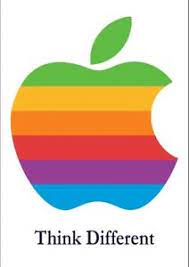
The Introduction Of The Apple-1977
The initial Apple logo design was quickly ousted by Steve. He hired a graphic designer by the name of Rob Janoff in early 1977. He had to come up with a fresh new Apple logo design. The logo would coincide with the introduction of the company’s first personal computer, the Apple II.
Steve Jobs wanted the Apple name and logo to be fused as one. And so, the famous Apple logo design was born. Janoff’s design was quite simple, a 2D, rainbow-striped apple with a bite taken out of it. The Logo had the bite mark so people wouldn’t confuse it with a cherry. The rainbow colors hinted toward the world’s first colored computer, Apple II.
Former Apple executive Jean Louis Gassée called the logo “the symbol of lust and knowledge.” The Apple logo symbolizes our use of their computers to obtain knowledge and, ideally, enlighten the human race.
The Refresh Apple Logo Design – 1984
In 1984 the logo went through small but meaningful changes. The text from the Apple logo was removed by Landor Associates to revamp the logo for the launch of Macintosh in the same year. This would turn the logo into an icon that would become, well, iconic for decades to come!
![]()
Monochrome Apple Logo Design: 1998 – Present
When Steve returned to Apple in 1997 the company was bleeding money and jobs. As part of his efforts to turn things around, Jobs decided to revamp the company’s entire brand image. In addition to revamping the company’s brand image, one of his big challenges was rebooting the logo; it was a universally recognized symbol and needed to be leveraged if the company was to survive. This is when the monochrome design replaced the rainbow version. The reason was that the many-colored logo did not go well with the metal casing of new Mac computers.
After a couple of years, the logo then took on a metallic look while embossing. It appeared on many of their products.
In 2007 the designer team came up with a glass-themed logo, which had its official status until 2013.
Today Apple fully embraces flat, minimalist logo design with a logo that comes in 3 colors: White, black, and silver. It’s a simple-yet-powerful logo, which perfectly resonates with the Apple brand. The millennial apple logo is now one of the sleekest and most famous logos in the world, just as famous or even more so than McDonald’s yellow arches.
![]()
Why is the Apple logo design so effective?
The Apple logo is among five of the most recognized emblems globally. The logo also represents the company’s name, which helps to boost brand recognition. Every time a person hears the name apple and sees their logo design, the mind reinforces the name attached to the Apple logo. Over the years, the pairing of the logo and brand name has made it easier for consumers to recognize the Apple logo. They can immediately connect it to the representation of the company.
Moreover, the brilliant evolution of the Apple logo design has made the logo today to be a minimalist, flat, elegant, and sleek design. These features are also an accurate representation of the companies motive’s behind its product designs. Its color scheme and flat 2D design make it incredibly easy to use across any marketing medium you can think of, whether on a billboard or small screen, like a mobile phone.
![]()
Ending Notes
You must know the importance of a brand logo by now. A logo can do a lot for your brand identity if made appealing enough and in perfect harmony with your company’s core objectives. Over time it will become synonymous with your business so you need to take all the precautionary measures against what you attach your business identity with.
Hence, if you need a logo design for your business you should hire experts. Experts who will understand the core objectives of your business, and keep them in mind while designing your business logo.
iCreative has experts, who will go to great extents to understand the core objectives of your business and what you have in mind in regards to your logo. They will also suggest what will work best for you. To book a free consultation session with one of our experts click here.