Things change with time! The same is with logo design. We can see some of the famous logos being drastically changed till now. As there are new inventions with every passing moment, people need to be upgraded. They need to keep everything up-to-date in order to walk with the world. Right? And when it comes to your brand or business, it’s the most important thing. Here we have an example of McDonald’s logo design; it was way different when it first started. However, if we see the recent one, it’s an “M” with two arches with a red background.
Now, we will look at some of the early versions of the Mcdonald’s logo to where it stands now.
The McDonald’s logo design history
We know Mcdonald’s as the fast-food empire today. It was once a food stall on the roadside of Monrovia, California. It all started when Patrick McDonald opened a food stall at the airport, which he called “Air Dome.” He began with the hotdogs at first but later added hamburgers and orange juice too.
Later in 1940, Maurice and Richard (Patrick’s son) moved the stall to San Bernardino, California, and came up with a new name: McDonald’s Bar-B-Que. And you can contemplate with a name that the menu changed too, including 25 barbecue items.
After eight years, the brothers realized that most of their gains came from the Hamburgers. At the same time, they started focusing on their service as well in order to maximize their revenue.
They also made changes to the menu by reducing it to just a few items, including hamburgers, milkshakes, apple pie, cheeseburgers, and fries. Also, the waiters were replaced with self-service; with Brother’s best efforts, they upgraded their kitchen in a well-organized manner.
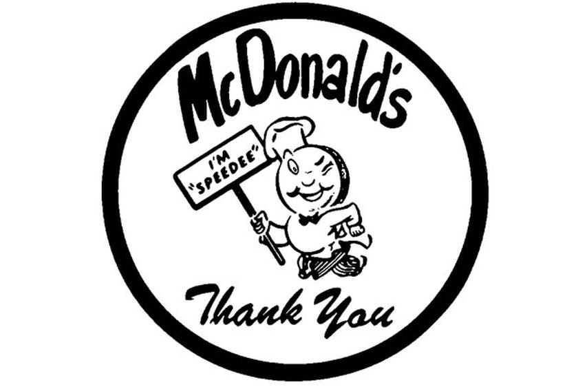
The winking tubby chef – 1948
In their initial days in 1940, they sold barbeque items along with hamburgers; also, there were no fries on the menu at the time. Now coming in 1948, the Brothers were doing so well in the fast-food section that they named it “Speedee service.”
Later they dropped the barbeque items from the menu since they wanted the service to be Speedee. For this purpose, they designed this tubby chef character (Speedee) logo to portray the message. In 1952, the name changed to a short one (Mcdonald’s).
In 1953, after settling on the name we are familiar with, they began revamping their business. It was the time when they sought out a man named Niel Fox and introduced their chain in another location. While in that same location, the famous Golden arch was first put in place. Those golden arches were also included in the Mcdonald’s restaurant architecture starting in 1953. It was until 1961!
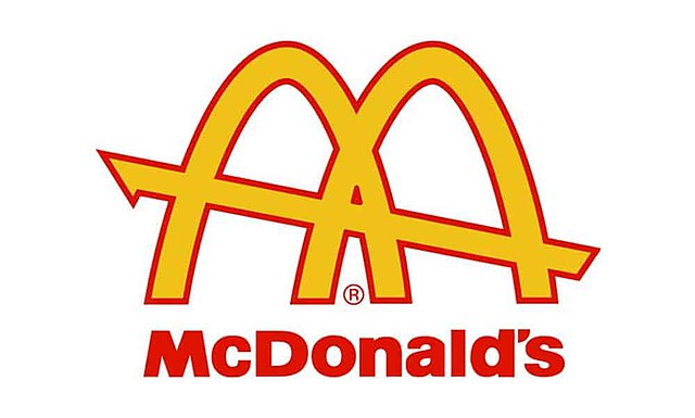
Golden arches – 1961
This year, rare arches were incorporated into the logo to make it a more professional logo design. The same year, Ray Kroc bought the business and requested a new logo from the Mcdonald’s president, Fred Turner. In the beginning, the president tried making it himself. Still, when he couldn’t, the head of the construction and engineering department, Jim Schindler, provided a logo design service and made a logo suitable for the franchise.
The man behind the arched Mcdonald’s logo design was Schindler. Still, his logo contained a tilted line moving through the ‘M.’ The logo indeed went through additional redos during 1961 – 2003.
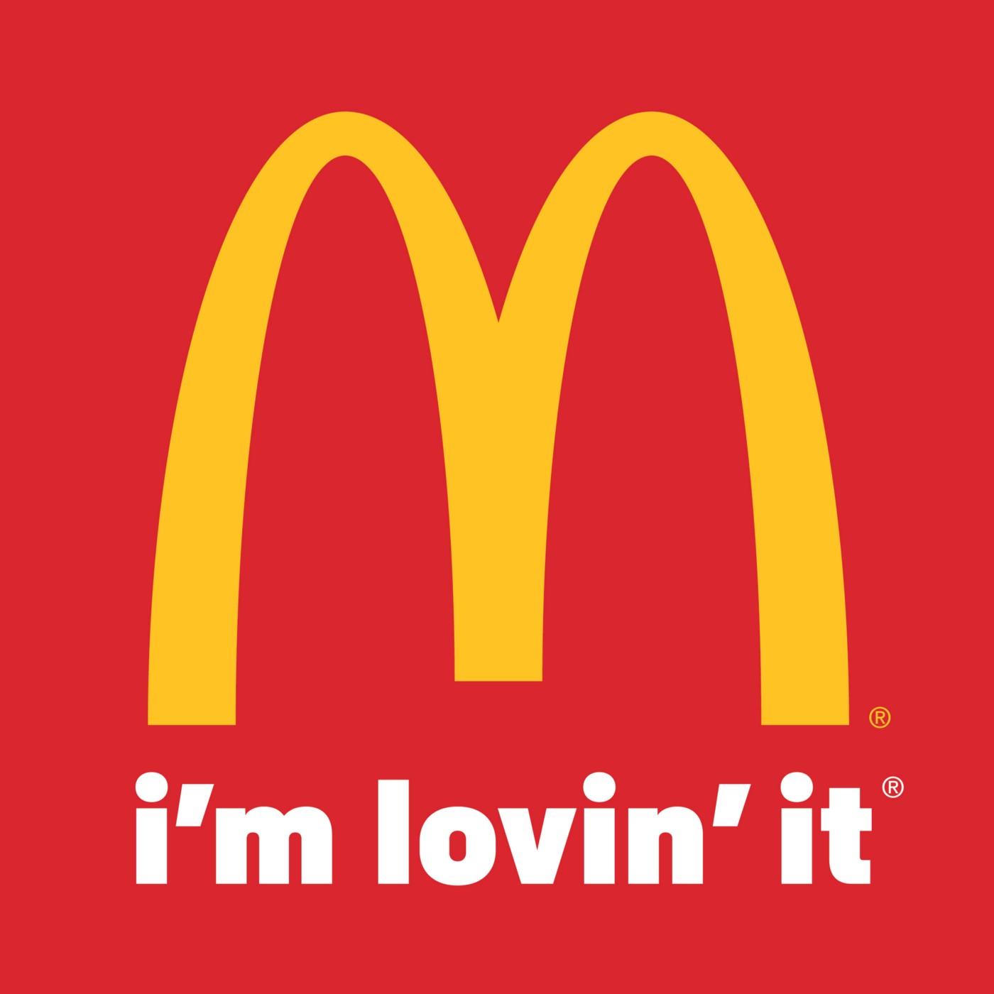
Famous slogan (I’m lovin’ it) – 2003
Though, here comes the magical year (2003) when the owners decided on the logo design and slogan, which is very well known till now. After some time, these Golden arches were the only element left in the design with a slogan beneath “I’m lovin’ it.”
It remains to be seen whether the logo will change once more in the coming years; however, one thing is certain: the present McDonald’s logo design has endured for more than 14 years. It is currently among the most well-known ones around the globe.
The famous McDonald’s logo design element
Among the most impactful elements of the design of a McDonald’s logo design is its resemblance to two golden-brown French fries tilted through into the shape of an “M.” It’s a visual hint that promotes one of McDonald’s greatest prevalent menus options without the audience noticing.
The other most important design component of the famous logo is that it’s relatively simple to other symbols (I mean, just an ‘M’ with two arches). And at a certain period when the existing logo was revealed, everybody recognized Mcdonald’s, and it was over a top food chain. People wouldn’t need a logo for what they offered; they already knew. Rather, they might want to see a simple and easily understandable logo, a logo that could be recognized from a distance.
The 2003 latest iteration of the McDonald’s logo design seemed to be ideal. And at last, the team decided to include the motto “I’m lovin’ it” in one’s logo. The supplier deliberately has used lower case letters and abbreviations in this motto to communicate a whimsical and casual voice.
The McDonald’s logo design prominence
Whether you love it or don’t, Mcdonald’s is now a popular symbol of American heritage, but not always for the best causes. But, currently, McDonald’s has come under criticism for encouraging bad sanitation choices. It was an impression the business is constantly striving to change, one their classic logo has come to define.
For the similar causes that McDonald’s has also received critiques around the globe, the United States has also been heavily criticized. The McDonald’s symbol was also seen as a mark for some of the less enticing factors of American heritage.
Despite all the negativity on one side, it still has so much popularity in pop culture. It has nearly innumerable appearances on TV, in films, comic books, and in art. It’s a bunch of free promotions for the brand and shows the influence of a simple, instantly recognizable logo.
If we talk about the recent time, the Mcdonald’s logo design is still being known worldwide. And the image made from all the bad choices they opted for doesn’t have much impact on the company since they already have a big name. Just as their logo design, McDonald’s ain’t going nowhere. You could expect to see the golden arches on public streets and in pop culture for centuries to come.
FAQs Related To Business Logo Design
Does color have an impact on logo design?
Answer: Along with different graphic elements, color is one of the most important that can be influential. It can be a critical factor in portraying the meaning of your logo. It is so authoritative that it can alter thinking, and stimulate a reaction and hormones in your body.
What are the primary rules for designing the best logo?
Answer: As a logo is considered to be the face of a company, you should be precise while designing one for your firm. Here are some things you need to consider:
- Your logo must reflect what your company is all about.
- It has to appear good in both black white and colored printing.
- Ensure that it is balanced and adjustable.
- Try to make it simple, since the complex ones are hard to adjust everywhere.
How many fonts can you use in a logo?
Answer: It should not be more than 2 or three. If you are considering using more than that let me tell you one thing it will make it inconsistent and too busy. It also depends on the text you are adding to your logo design as McDonald’s logo design have added. When in need of professional help, you can always opt for iCreativeSOL for guidance.
Read More: 97 Years Of History And Evolution Of Audi Logo Design
End line
We’ve all seen Mcdonald’s logo design for nearly a decade. And, most likely, future generations will see it as well. I mean, we all love it – or at least I’m lovin’ it! Although its menu has changed several times since 1940, McDonald’s has consistently provided us with the best.
They definitely have maintained their name with the quality they provided, while the most amazing thing about them is that they don’t need an introduction. Show ‘yellow-colored M’ to anybody all around the world; they would know (just with a single sight) that it’s a McDonald’s logo.
That’s how the branding is done! When people start recognizing your logo with a single glance, know that you are going in the right direction. So, if you are stuck somewhere in your logo design or branding, you should contact an agency that could provide professional assistance. For example, you can opt for iCreativeSOL for the best logo design services.