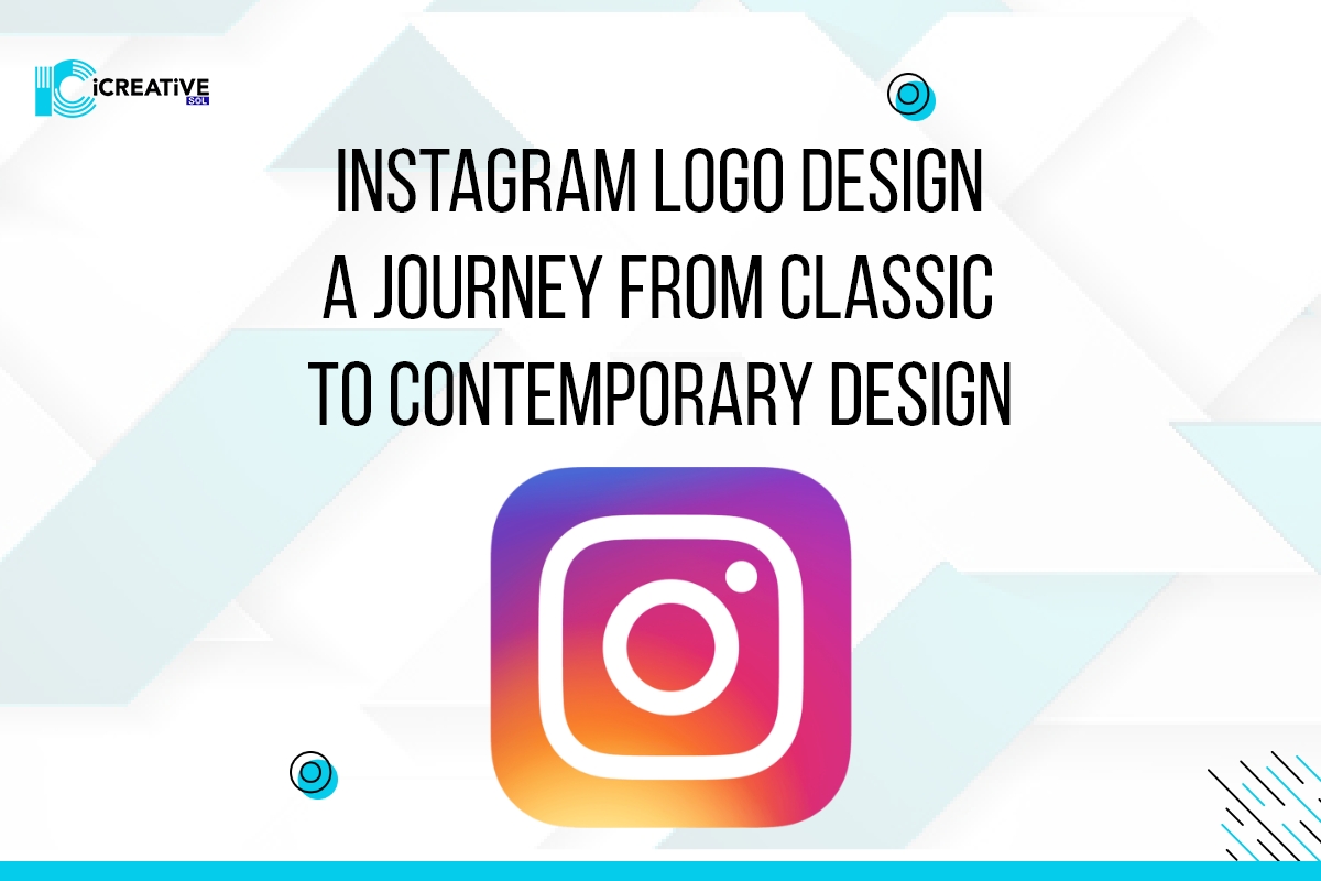
Instagram, with the most number of influencers, has over a billion users. Which makes it the fourth most used social media platform worldwide. It started as an app for bringing people close by sharing videos and pictures.
Instagram logo design from the first year of its creation has been very classical. It started as a picture of a Polaroid camera with high focus given to the details. However, it has changed over the past two decades.
Logo design is the most important and appealing factor for any business or a new venture. It helps to develop an image and gain the trust of the audience. ICreativeSOL is one of the top-notch agencies in providing logo design services. We help our clients by designing logos that match their product design and uniquely complement them. Moreover, ICreativeSOL has helped its clients to revamp their brands to be more professional and audience-centric.
To get a logo designed by professionals that help you become market competitive and stand out among the crowd, click here.
The concept behind the Instagram logo
Instagram is a mix of two words: Instant and Telegram. It began as a platform that let people share pictures and videos immediately. A Polaroid camera is something that does exactly the job. Hence, Instagram chose Polaroid to be its logo design.
Evolution of Instagram logo design- A chronological history
The Instagram logo design has changed quite a few times over the past two decades. It has been a rollercoaster ride regarding audience acceptance of the advanced logo designs.
-
The very first Instagram logo design:
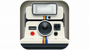
Kevin Systrom designed the first-ever logo of Instagram in 2010. He designed a polaroid camera with rainbow stripes on it. The Instagram logo design defined the purpose of Instagram at that time: to share pictures instantly.
It was a well-detailed Instagram logo design that covered almost all aspects of the polaroid camera. It had a very classical touch to it. Kevin Systrom chose a very aesthetically pleasing color scheme while designing the logo, making it look appealing to the audience.
It was a minimal logo with Instagram written on its right middle, with a vintage fond.
Although the designed logo looked very appealing, it got changed within the first year.
-
The first step toward modern Instagram logo design
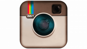
In 2010, a few months after, Kevin Systrom and his team took a big step. They hired a professional logo designer: Cole Rise. Cole Rise designed the revolutionary Instagram logo design, influenced by the Bowell and Howell camera from the 1950s.
This logo had a very minimal touch to its design; along with the minimal design, it had its initials are written on it, which made it more appealing and easy to remember. They brought the lens a little more in the middle, and the viewfinder was brought up front on the right top. And they also kept the stripe on the left top.
-
The first modification after its re-creation- 2011
After the first modern design by Cole Rise, the audience’s level of expectation and anticipation became way more. The Instagram logo design, from classical to contemporary, got highly accepted among the crowd. However, in the year 2011, after much consideration, the Instagram logo got slightly modified. The camera lens was made more detailed. Along with that, this was the first time the short form of Insta.
-
The Insta logo as per modern aesthetics- 2016
2016 was the year when the company decided to redo the Instagram logo design completely. Instead of keeping the original color scheme or design, they experimented with something completely new.
The new Instagram logo had a very futuristic vibe to it. Instagram modernized the whole logo. Instead of a camera portrayal, they introduced an outline sketch in white, complemented by a rainbow color gradient background.
-
The detailings- 2022 to present
Source: Instagram website
The redesign of the Instagram logo had a very refreshing touch to it. It is pretty much similar to its previous version. However, the new Instagram logo design had somewhat more bright colors. The gradient background has a white softened square contour and a circle for the camera lens in the middle. The color scheme in this designed logo is a bit more vibrant.
Instagram Logo and development of its watermark
On the one hand, the Instagram logo design was being modernized, and on the other, the Instagrams wordmark was also being enhanced.
-
The first wordmark- black and white, 2010-2013

The first-ever wordmark was introduced alongside the app’s logo design. It was designed in such a way that it appears to be handwritten. The alphabets were seen in a very haphazard way and were not of equal size.
-
The second wordmark, 2013-2015
The second wordmark was made more aesthetically pleasing. Instagram gave a calligraphic look to its new wordmark, making it look more appealing. The cherry on top, the color of the wordmark, was made blue in a darker shade.
-
The third logo watermark, 2015-2016
The third Instagram logo design watermark was just improved in its color. The logo’s design and font were made similar to the previous one. However, they advanced the logo in color. They made a lighter and brighter shade of blue in this wordmark.
In 2016, Instagram brought back its original color for the wordmark. The only change made in its current design was the change of color. They changed the light blue color to black, which was more appealing and classic.
Conclusion
It is well established that every small or massive business needs a logo design. A design that represents their venture and allows the audience to connect and trust them. But to design such a logo, who can understand the market trends and build something fresh and unique.
Hence, if you need a logo design for your business, you should hire experts who will understand the core objectives of your business first and keep them in mind while designing your business logo.
iCreativeSOL has experts who will greatly understand your business and design a logo that stands exclusive to your brand. iCreativeSOL helps its client to build a brand that is fresh and different from others to bring more traffic. To book a free consultation session with one of our experts, click here.
